


The digital landscape has undergone a remarkable metamorphosis over the past few years, evolving from static pages of text and imagery into dynamic, sentient-feeling ecosystems. As we navigate through 2026, web design is no longer just about aesthetics or making a brand look trustworthy on a screen. It has fundamentally transformed into an immersive, multi-sensory discipline where user experience (UX) and user interface (UI) merge seamlessly with advanced artificial intelligence, spatial computing paradigms, and profound ethical considerations regarding accessibility and environmental sustainability.
The modern internet user is hyper-sophisticated. Having grown up interacting with fluid mobile interfaces, lightning-fast web applications, and immersive augmented reality experiences, today’s audiences possess an intuitive radar for friction, poor performance, and outdated design choices. Consequently, web designers are pushed beyond traditional boundaries. They must orchestrate experiences that respect the user’s cognitive load, data privacy, and physical well-being. This comprehensive guide explores the definitive trends shaping web design in 2026, offering a roadmap for creators, developers, and visionaries aiming to build the next generation of web experiences.
Artificial Intelligence as a Collaborative Co-Creator
The Shift from Static Layouts to Dynamic Personalization
Artificial intelligence has officially graduated from a novelty text-generation tool to the beating heart of modern web architecture. In 2026, websites are no longer built as rigid templates meant to serve every visitor the exact same experience. Instead, AI-driven architectures analyze user intent, behavioral patterns, device context, and historical interactions in real-time to dynamically assemble layouts, adjust color palettes for readability, and reorder content hierarchy on the fly.
This hyper-personalization ensures that a first-time mobile visitor seeking quick answers sees a streamlined, high-converting funnel, while a returning enterprise client receives an in-depth dashboard tailored to their specific industry needs. Designers are shifting their focus from drawing every single screen state to designing the overarching design systems, ethical constraints, and algorithmic boundaries within which the AI operates.
Generative UI and Contextual Micro-Interactions
Beyond page-level personalization, generative UI components are redefining how users interact with digital tools. Buttons, navigation menus, and form fields now adapt their states based on immediate user context. For instance, if a user hesitates on a checkout page, the UI might intelligently surface a micro-interaction—such as an interactive trust badge, a streamlined payment option, or an AI-assisted chat prompt—specifically designed to alleviate that user’s exact friction point. This level of responsiveness makes browsing feel less like operating software and more like engaging with an attentive digital assistant.
Spatial Minimalism and Hyper-Tactile Realism
Breaking the Flat Design Monotony
After years of flat design, minimalist gradients, and corporate Memphis illustrations dominating the web, 2026 has introduced a refreshing counter-movement: spatial minimalism paired with hyper-tactile realism. While the core philosophy of minimalism—clarity, whitespace, and a lack of visual clutter—remains intact, the visual treatment of UI elements has evolved dramatically.
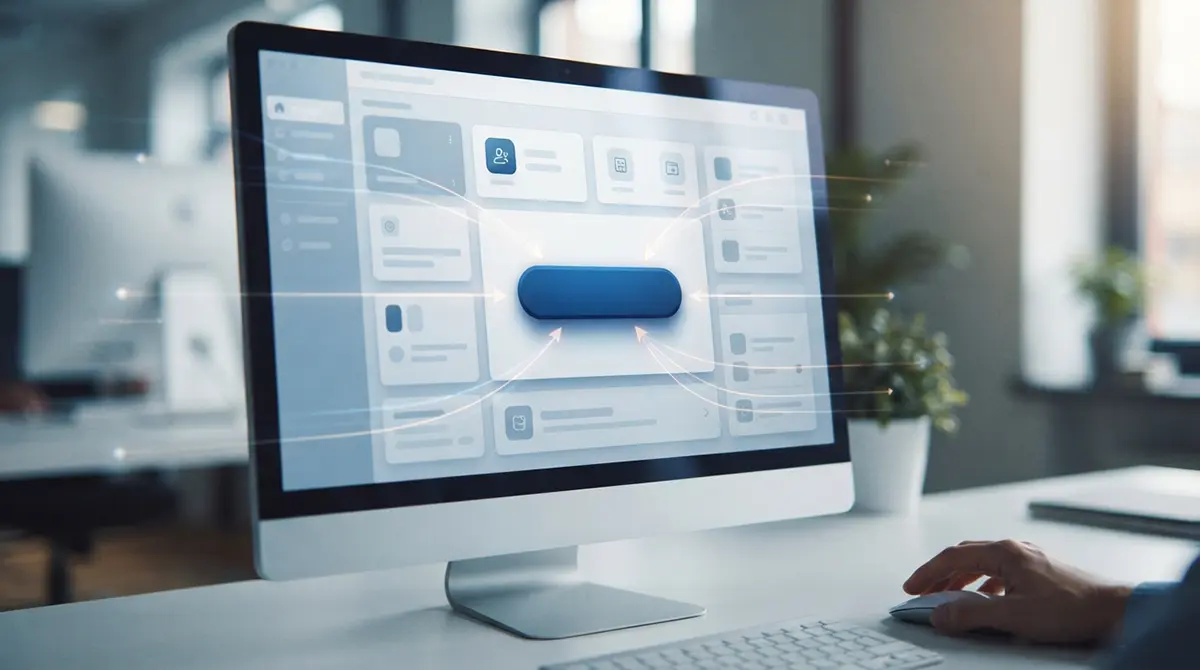
Buttons, cards, and containers now feature subtle, physics-based depth. Utilizing advanced CSS shaders and WebGL, designers are crafting interfaces where elements cast soft, realistic shadows, respond to cursor hovering with organic elevation, and mimic the tactile qualities of physical materials like frosted glass, brushed metal, and textured paper. This isn’t about returning to the heavy skeuomorphism of the early smartphone era; rather, it is a sophisticated, restrained nod to physical reality that helps users intuitively understand what elements are clickable, draggable, or elevateable.
The Return of Bold Typography as Art
With layouts becoming cleaner and more spacious, typography has stepped into the spotlight as the primary graphic element. Standard web fonts have been replaced by variable typefaces that morph and respond fluidly to scroll velocity, cursor proximity, and viewport resizing. Designers are pairing ultra-large, editorial-style serif headings with precise, high-contrast monospace subtext. This juxtaposition creates a sophisticated print-like editorial aesthetic on the web, turning standard corporate websites into visually captivating digital magazines.
Immersive 3D Graphics and WebXR Integration
Making Three-Dimensional Content Lightweight and Accessible
The integration of three-dimensional graphics into standard web browsers was once hindered by heavy file sizes, slow loading times, and poor mobile optimization. Today, thanks to optimized rendering pipelines, compressed GLTF formats, and widespread hardware acceleration, 3D elements are standard fixtures of modern web storytelling.
-
Interactive product showcases allow e-commerce shoppers to rotate, scale, and inspect items down to individual fabric textures right inside the browser.
-
Abstract 3D background shapes provide ambient movement, reacting to scroll depth and gyroscope data on mobile devices to create a profound sense of depth.
-
Spatial audio cues integrated with 3D elements provide an auditory dimension that enhances user immersion without overwhelming cognitive capacity.
Preparing for the Spatial Computing Era
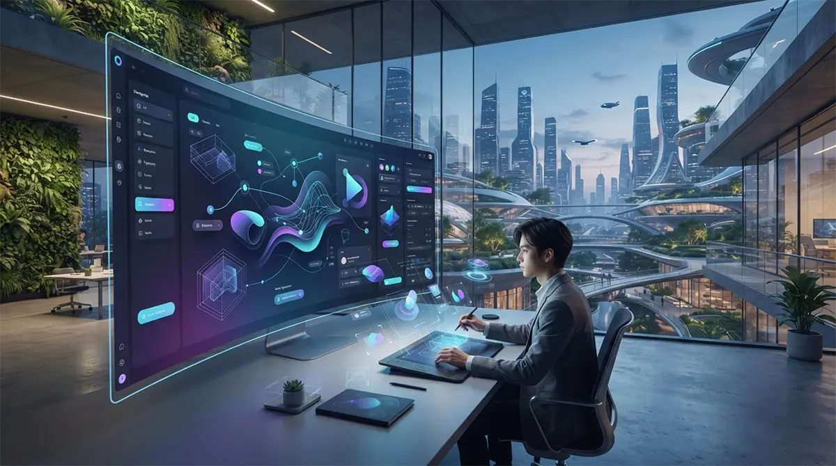
As spatial computing headsets and augmented reality glasses become increasingly mainstream, websites are designed with spatial awareness in mind. Modern web frameworks now support WebXR natively, allowing users browsing on desktop or mobile to seamlessly transition a webpage into a 3D spatial room when viewed through compatible hardware. This dual-capability ensures that web design remains versatile, bridging the gap between flat screen interactions and spatial environments.
Sustainable Web Design and Eco-Conscious Architecture
The Hidden Carbon Footprint of the Internet
Digital experiences have a physical cost. Every server request, high-resolution image stream, and complex JavaScript animation consumes electricity, which in turn generates carbon emissions. In 2026, environmental sustainability has become a core metric of good web design. Brands and agencies are waking up to the reality that a bloated, slow website is not only bad for user conversion rates—it is actively harming the planet.
Core Practices of Green Web Engineering
Sustainable web design focuses on ruthless efficiency and minimizing data transfer. Key strategies adopted across the industry include:
-
Dark Mode Defaults: Leveraging OLED screen technology by prioritizing dark color schemes that require significantly less energy to illuminate on mobile devices and modern monitors.
-
Aggressive Asset Optimization: Serving next-generation image formats like AVIF, utilizing vector graphics where possible, and lazy-loading all heavy media assets so they only download when entering the user’s viewport.
-
Decarbonized Hosting: Partnering with green-certified web hosting providers powered entirely by renewable energy sources such as wind, solar, and hydroelectric power.
-
Streamlined Codebases: Removing redundant JavaScript libraries and optimizing CSS delivery to reduce processing power required by the user’s device CPU.
Advanced Motion Design and Kinetic Storytelling
Scroll-Driven Narratives That Captivate
Motion design in 2026 is deliberate, purposeful, and deeply integrated into the narrative structure of a website. Gone are the days of arbitrary animations that distract the user or slow down page rendering. Instead, motion is used as a narrative vehicle—guiding the user’s eye through a chronological story or a complex product breakdown via scroll-driven choreography.
As the user scrolls, elements fade, scale, reorder, and transform in sync with the narrative beat. This technique transforms a passive reading experience into an active journey. When executed correctly, kinetic storytelling reduces bounce rates drastically because users remain engaged simply out of curiosity to see what happens next in the visual sequence.
Maintaining Performance and Accessibility in Motion
While motion is captivating, modern design standards strictly regulate it to protect users with vestibular disorders. Websites in 2026 automatically detect the user’s operating system preferences and respect the prefers-reduced-motion media query. If a user has motion sensitivity enabled, complex parallax and scaling animations are gracefully replaced with clean, instantaneous state changes, ensuring that stunning visual storytelling never compromises digital inclusivity.
Inclusive Design and Universal Accessibility
Designing Beyond Compliance
Accessibility (a11y) has evolved from a legal compliance checklist into a fundamental driver of creative excellence. Designing for inclusivity means recognizing that disability can be permanent, temporary, or situational—such as trying to read a website in blinding sunlight or navigating a page with one hand while holding a coffee.
Modern design systems are built from the ground up with accessibility embedded into every component token. This includes rigorous adherence to contrast ratios, scalable typography that never breaks when users zoom up to 200%, fully keyboard-navigable interface flows, and comprehensive screen reader support.
Multimodal Interaction Models
Inclusive design in 2026 also embraces multimodal interaction. Users are no longer restricted to traditional mice, keyboards, or touchscreens. Voice navigation, eye-tracking integration, and gesture-based controls are increasingly supported, allowing individuals with diverse physical capabilities to navigate complex web applications effortlessly. Furthermore, localized AI translation tools ensure that regional nuances, dialects, and cultural contexts are respected, making global digital spaces truly universal.
Micro-Interactions and Tactile Feedback Loops
The Power of the Smallest Details
Great web design is often defined by the micro-interactions that users barely consciously notice, yet would deeply miss if they were gone. These are the tiny animations, sound effects, haptic pulses (on supported devices), and visual shifts that confirm an action has taken place.
Whether it is a heart icon that bursts into colorful confetti when clicked, a search bar that smoothly expands as you focus on it, or a toggle switch that snaps into place with a satisfying spring physics curve, micro-interactions inject personality and life into an interface. In 2026, these details serve a psychological purpose: they close the feedback loop between human intent and digital execution, reducing anxiety and making the software feel alive, responsive, and deeply satisfying to use.
Dark Mode Mastery and Dynamic Color Ecosystems
Moving Beyond Simple Inversion
Dark mode is no longer a toggle switch buried deep inside a settings menu; it is a primary design state that receives just as much love, attention, and artistic direction as traditional light mode. However, modern dark mode design has evolved past simply inverting black and white pixels.
Designers now craft rich, atmospheric dark themes utilizing deep, desaturated chromatic grays, midnight blues, and dark purples instead of pure #000000 black, which can cause harsh contrast strain. Furthermore, neon accents and glowing gradients are deployed selectively against dark backgrounds to create a futuristic, high-end aesthetic that feels immersive and visually striking, particularly on modern OLED displays.
Typography, Readability, and Content-First Architecture
Honoring the Written Word
Despite the explosion of 3D graphics, AI-driven layouts, and immersive motion design, the fundamental currency of the web remains information. Content-first architecture dictates that the message takes precedence over the medium.
Typography in 2026 reflects this philosophy. Line heights, column widths, and font scaling are meticulously optimized based on ergonomic research to minimize eye fatigue during long reading sessions. Designers are collaborating closely with UX writers and content strategists to ensure that typography scales gracefully across every conceivable device, maintaining an optimal reading rhythm whether viewed on a massive ultrawide desktop monitor or a compact foldable smartphone screen.
Security, Privacy, and Trust-Centric Design
Designing for Transparency in a Data-Driven World
Trust is the ultimate luxury in the modern digital economy. With users increasingly protective of their personal data, web design must actively communicate safety, transparency, and security.
-
Clear Consent Mechanisms: Cookie banners and privacy permissions are no longer designed as dark patterns meant to trick users into accepting tracking; instead, they are clean, straightforward, and respectful UI modules that give users granular control over their data footprint.
-
Visible Trust Indicators: Security badges, verified certifications, encryption status indicators, and transparent privacy policies are integrated cleanly into conversion funnels without creating visual clutter.
-
Empowerment Through Control: Platforms that handle sensitive data provide users with clear, intuitive dashboards where they can audit their stored information, export their data, or delete their accounts with a single click.
The Intersection of Local Expertise and Global Standards
Building Digital Bridges Worldwide
While web design trends are driven by global technological advancements, the execution of digital platforms often requires deep localized expertise to resonate with specific regional markets. For instance, businesses operating in fast-growing commercial hubs often require specialized technical guidance to navigate unique regulatory frameworks, localized payment gateways, and distinct cultural preferences.
Navigating these multifaceted requirements successfully often demands specialized regional partnerships. When regional enterprises look to elevate their online presence, collaborating with experts who understand both cutting-edge global design systems and localized infrastructure, such as teams providing comprehensive website support dubai, ensures that digital platforms achieve maximum performance, security, and cultural resonance.
Looking Ahead: The Future Horizon of Web Design
As we look toward the horizon beyond 2026, the boundaries between physical reality and digital spaces will continue to dissolve. Brain-computer interfaces, ambient computing environments, and fully autonomous AI agents will redefine what a “website” actually is. Will websites even consist of flat rectangular viewports in five years, or will they exist as fluid streams of context delivered directly to our field of vision?
Regardless of how the technology shifts, the core principles of exceptional web design will remain steadfast. Empathy for the human user, an unwavering commitment to accessibility and sustainability, and a passion for crafting intuitive, beautiful, and frictionless experiences will always define the pinnacle of digital craftsmanship. The future belongs to designers who can balance the raw power of cutting-edge technology with the timeless art of human storytelling.